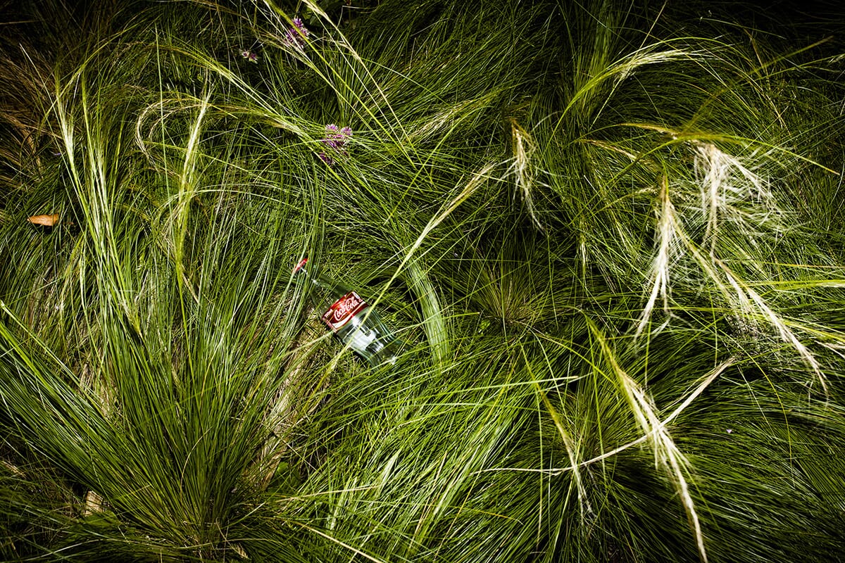
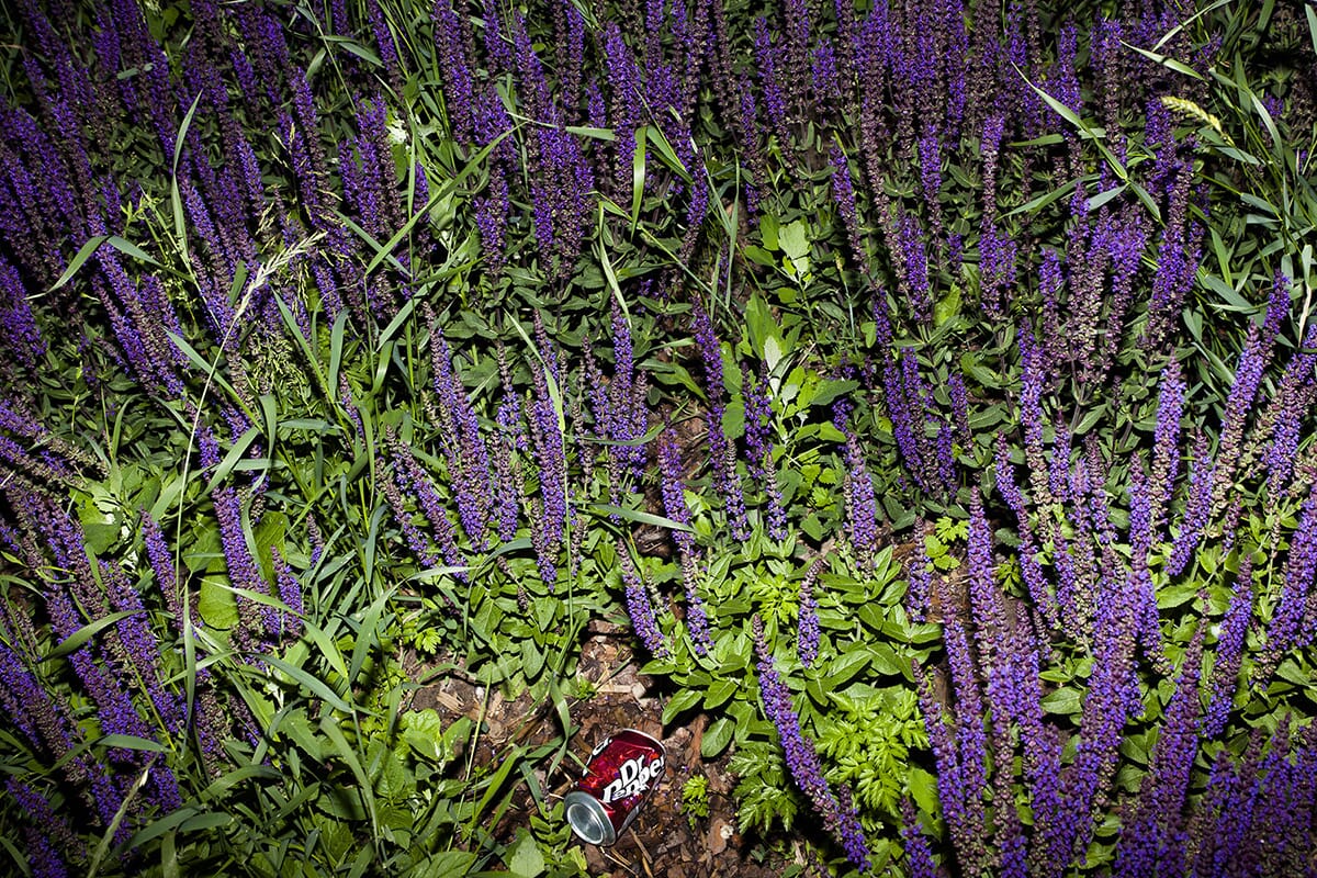
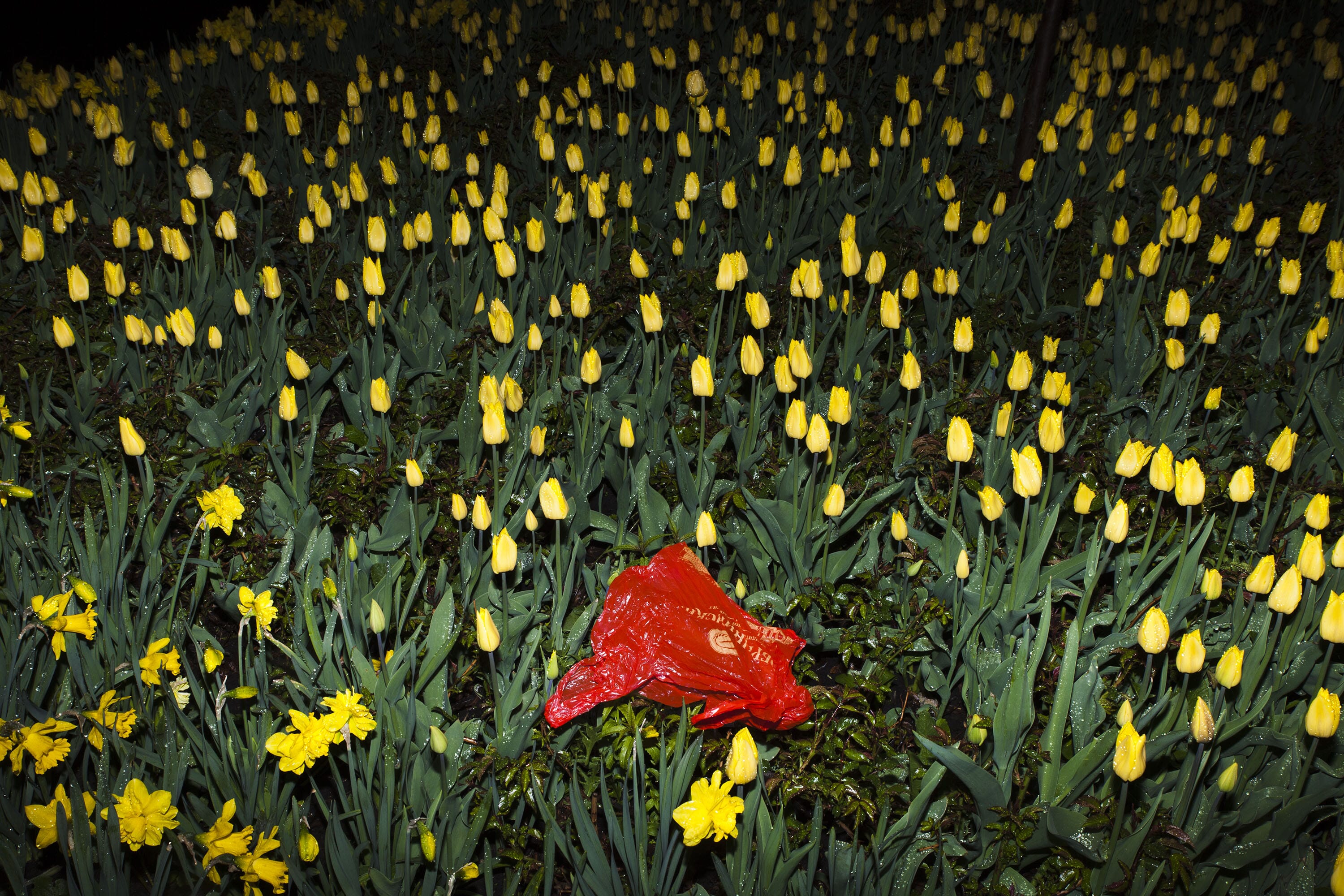
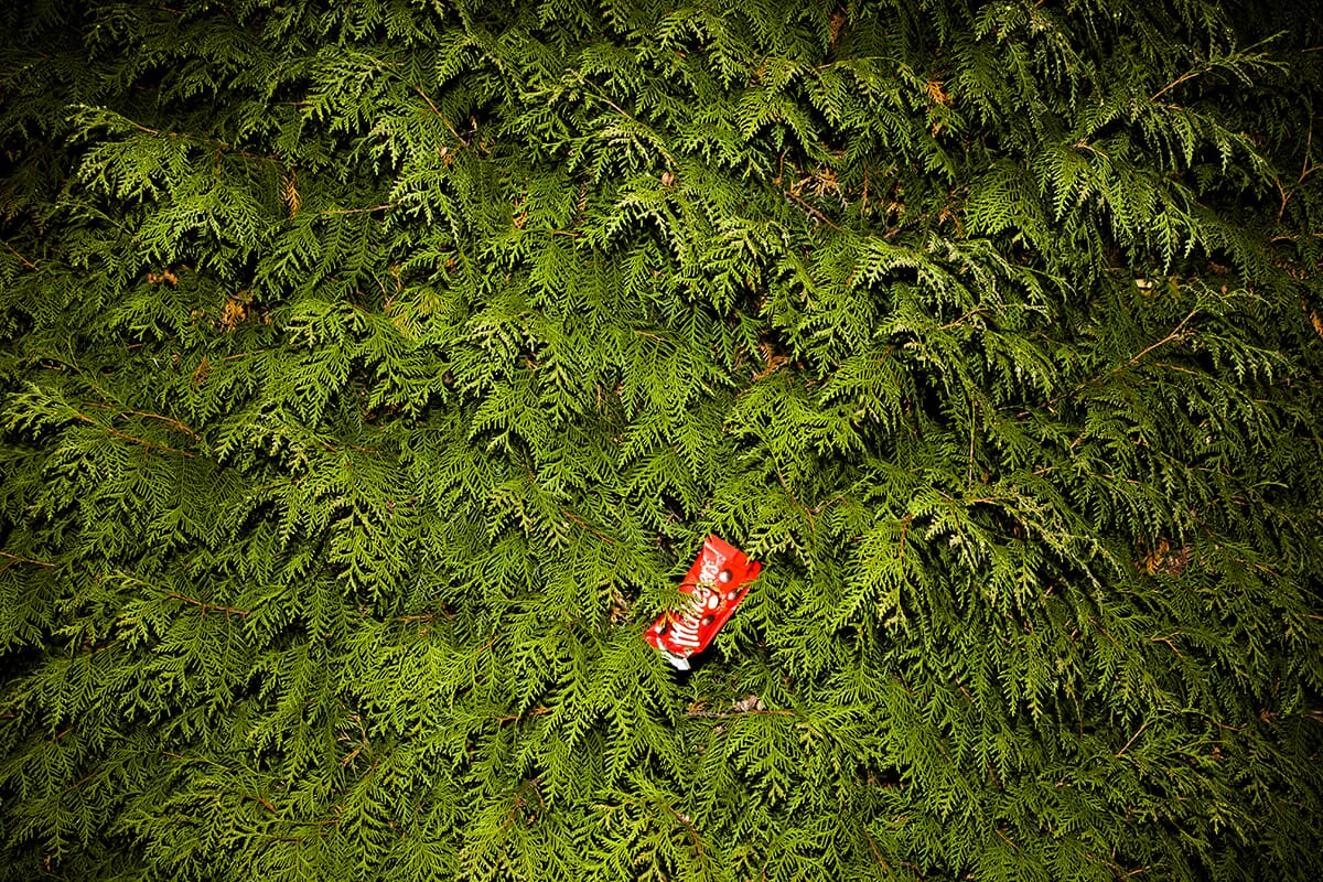
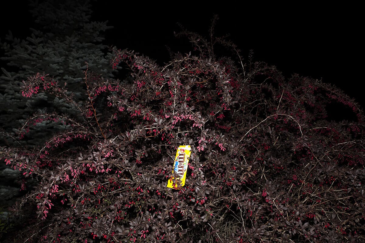
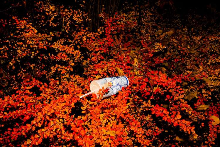
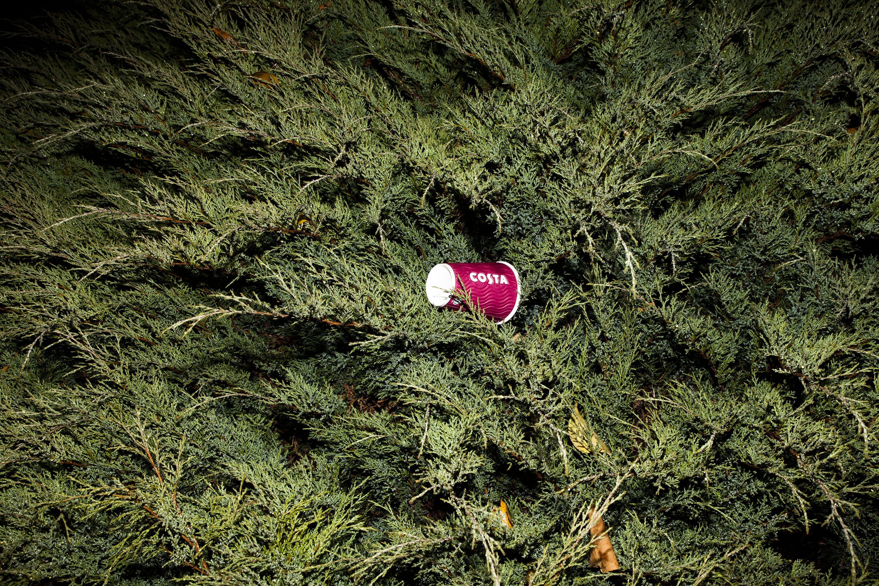
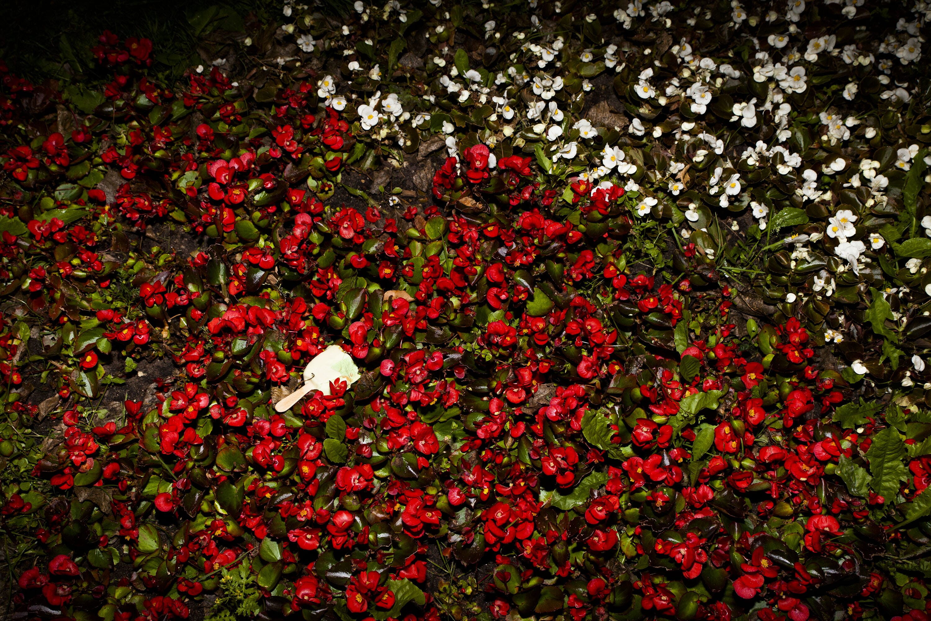
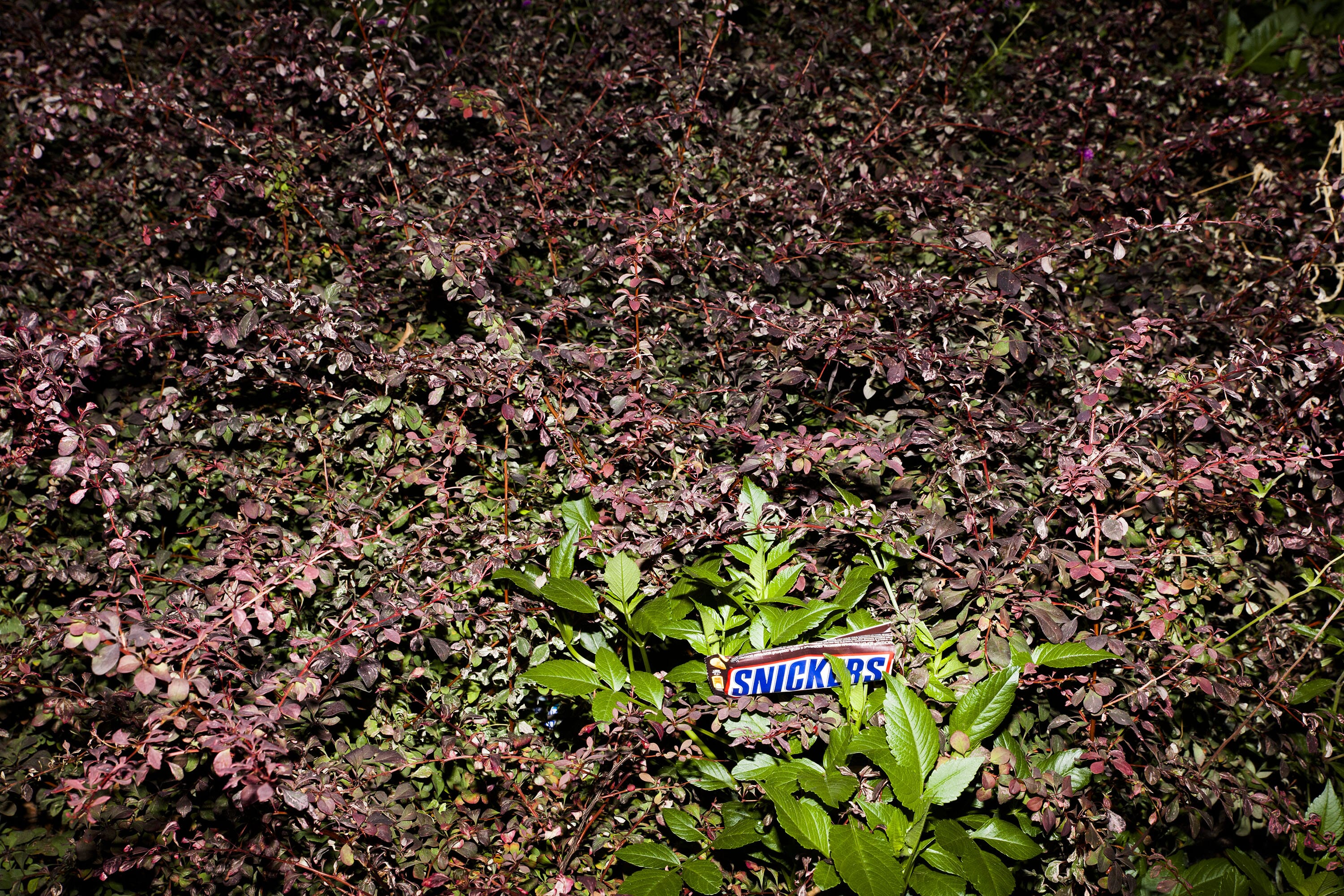
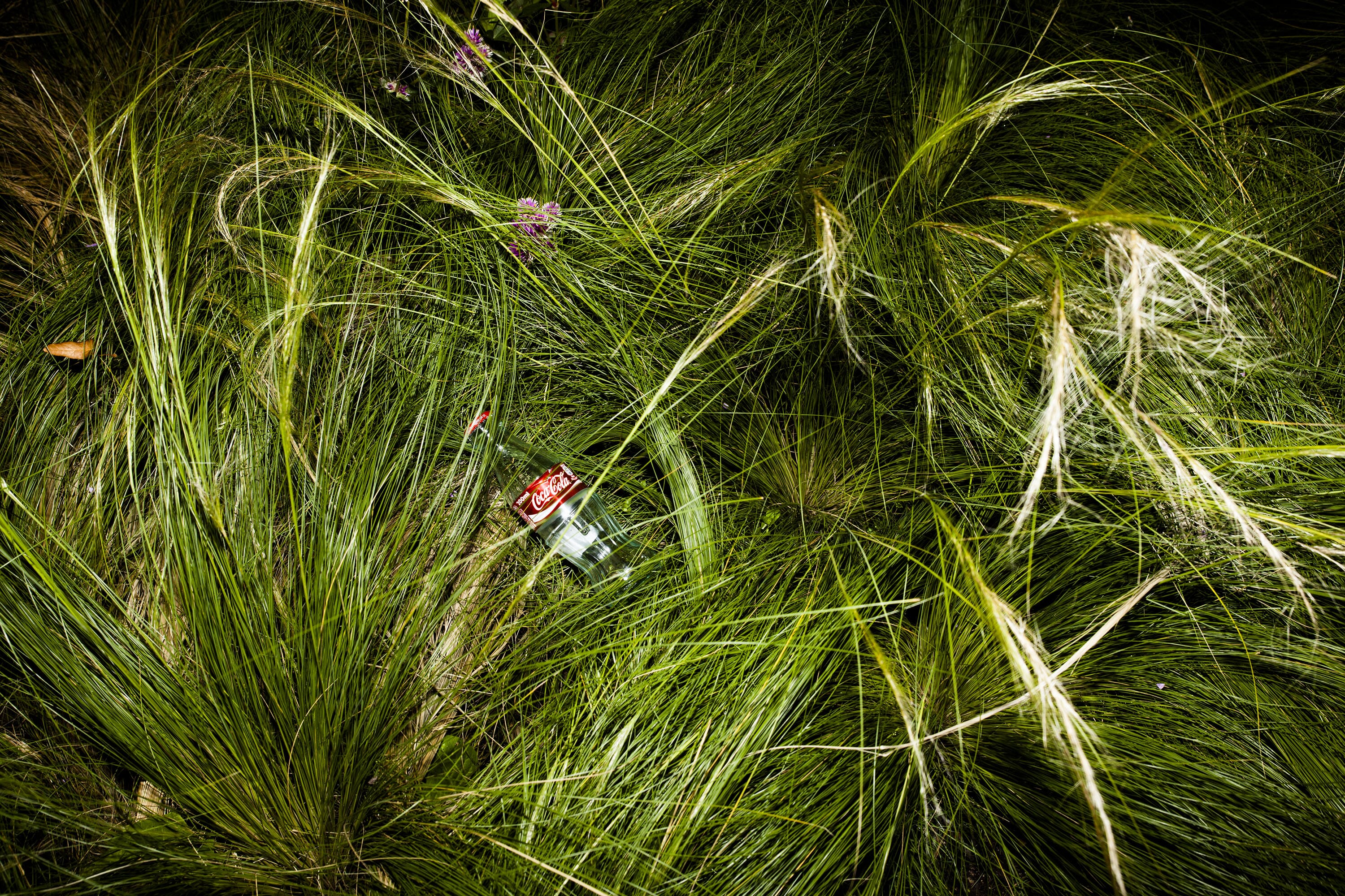
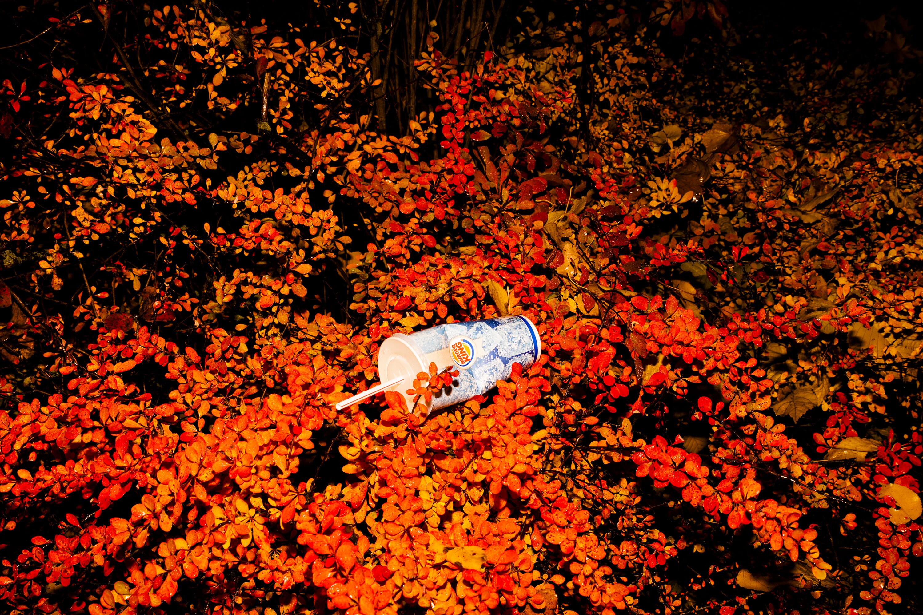
At first glance, Alexander Egorov's bright "Stickers" seem nothing more than a parade of world brands or, if you like, an impressive collection of stickers. McDonalds, Burger King, Coca-Cola, Snickers, Mars, Nestle ... - discarded, crumpled wrappers and packaging look very attractive, not worse than fresh products on the shelf of supermarket. It's the right time ask: why are there so many emotions? Who’s using who: the consumer are using manufacturer or vice versa?
Alexander Egorov, a graduate of the University of Printing and the British Higher School of Design, is working a lot in the fashion industry, taking photographs for glossy magazines, handy with the aesthetics of advertising photography. Shooting at night with a bright flash, he recreates the "crime scene", confusing with its elegance and juiciness. These obviously staged, crumpled symbols of capitalism are so beautiful here and now, taken as if by surprise, so they are not exactly what they seem. In these series, a critical viewer can see the photographer's desire to combat the symbols of consumption, pop culture and gloss, to suspect in this a sincere ecological statement. But is this really the author's idea and how big is the share of irony here? Or for another viewer this is not about the irony at all, but about the possibility of enjoying a visual image, whatever its origins ...
If we try to disassemble the author's method in detail, gradually these seemingly opposing approaches begin to work together. Egorov explores the nature of color - formal search leads to a critical statement. Perhaps following the philosophical reflections of Kazimir Malevich on art and man: "We can not defeat nature, because a human is a nature" ("On New Systems in Art", 1919), Egorov confronts man-made nature (park landscape) and visual waste of consumption culture. By placing obvious artificial objects - plastic " evidences" of consumption into a pseudo-natural environment, the author (referring to their common origin, according to Malevich) organizes their connection at the level of color harmony. The flash makes all colors saturated and seemingly made from the same material. The work of the best brand managers and packaging designers is verified and approved by tulips, barberry and fern.
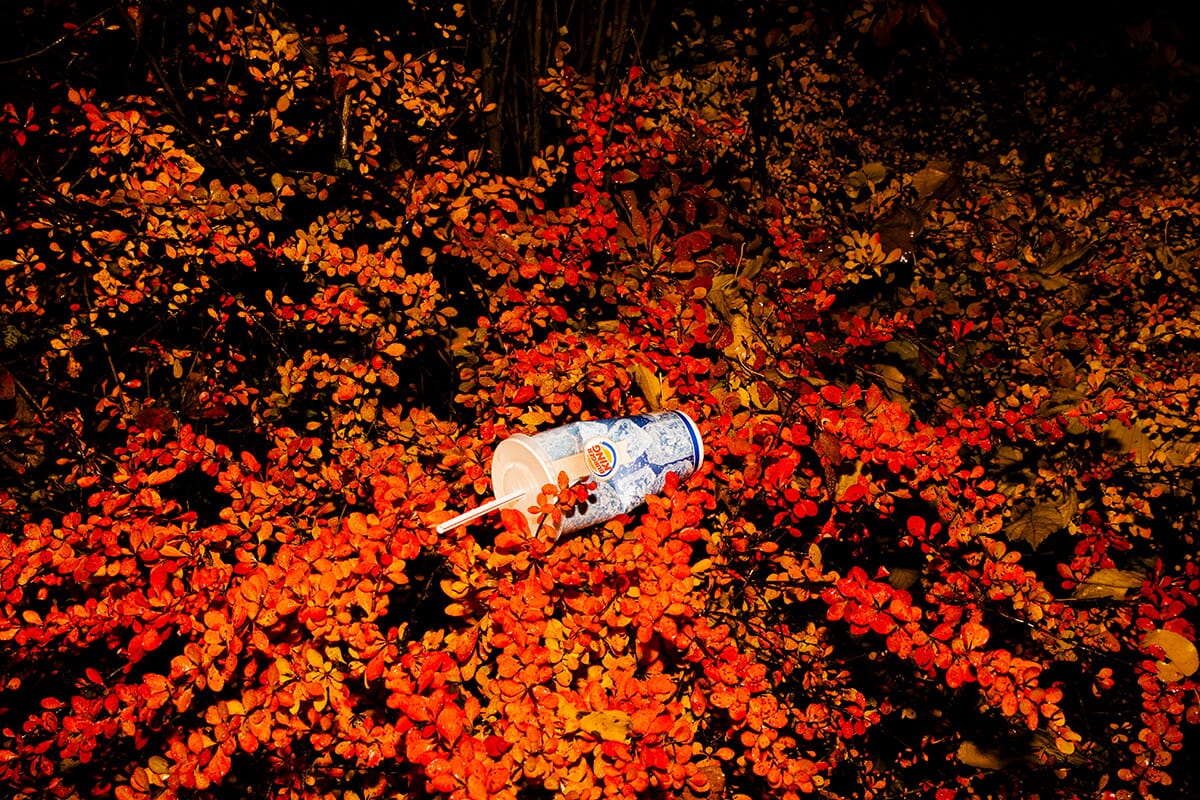
After the first minutes of wathing, the viewer, having mastered the first critical layer of the statement, is getting immersed into pure contemplation. In the final chord, one does not even need a color: a virgin white disposable cup (paper cup) takes on all the previous meanings and connotations, its basic shape clearly echoing the project's external line. Imagination can only place there a sticker of any brand of a matching color.
Katerina Zueva
Works
EXHIBITION


